TekNOW Services

  • Статус: Closed
  • Винагорода: $60
  • Надіслані роботи: 32
  • Переможець: Hobbygraphic

Стисле описання конкурсу

Remote technical support company, with emphasis on concierge style services, looking to update and polish EXISTING logo and banner, with professional looking, high resolution images for all branding purposes, including use on new website in progress.
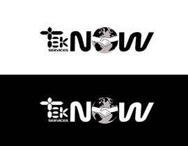
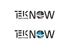
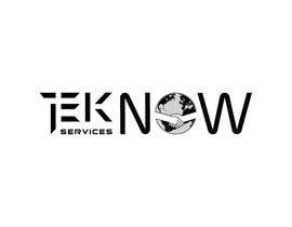
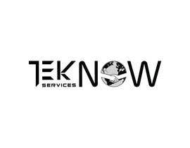
LOGO:
- GLOBE to be modified, by shifting continents, to show more of North America, including Florida above the handshake, in upper left quadrant; more of Europe in upper right quadrant; more Africa in lower right quadrant; more South America in lower left quadrant.
- HANDSHAKE based on the reassuring comfortable posture of a real-life handshake (much like my existing), instead of aggressive or hand drawn, without shirt or jacket to maximize view of continent on globe; outline only of handshake should be transparent through the globe to the background, with forearms centered in appearance on the globe.

BANNER
- Name "TekNOW" (pronounced tech now) should have the letters in "Tek" convey technology with detail and precision, and be highly readable (not to busy), the "T" should resemble a cross, the "E" a hamburger-menu icon, and the "K" in similar style lettering.
- The "NOW" should convey speed (speed lines, italicized W, etc,?); the O is the globe with handshake logo; the W is italicized for speed affect.
- Spacing between all letters, and sizing/boldness should look balanced for the word "TekNOW" as a whole.

I have extended this contest for at least another week and reconsidered past rejected work in order for my comments to remain visible to all.
Rejected entries don't have applicable comments on them and are rejected to minimize my list of entries.
I am continually rating all the entries so I can see the best of the current active entries on top of my list.
ALL comments should be considered, especially on existing active entries, when submitting new ideas.

Currently, I am reviewing entries in black and white only, for comparison, and to ensure the final image is simple and looks good without color.

Please be original and creative, as no idea is "unliked", I will respond to all entries appropriately...

Рекомендовані навички

Відгук роботодавця

“Petar was very eager to please and it was awesome to see him produce what I was thinking! He was quick to answer my comments with renditions of my ideas, as well as adding his own creativity to the project. His expertise is evident with the quality of work produced and his attention to detail. I am very pleased with the outcome.”

Зображення профілю Teknowz, United States.

Найкращі роботи цього конкурсу

Переглянути більше робіт

Публічна роз'яснювальна дошка

  • Teknowz
    Організатор конкурсу
    • 5 роки(ів) тому

    No one left to challenge the top rated entries???

    • 5 роки(ів) тому
    1. damien333
      damien333
      • 5 роки(ів) тому

      on the way

      • 5 роки(ів) тому
  • Teknowz
    Організатор конкурсу
    • 5 роки(ів) тому

    "TekNOW Services"

    • 5 роки(ів) тому
  • Teknowz
    Організатор конкурсу
    • 5 роки(ів) тому

    With less than a week to go, ONLY those who have read ALL the comments on ACTIVE (not rejected) entries, and consider those comments when submitting their entries, will have a chance at winning this contest. I am paying close attention to those entries in order to steer the design in the direction I'm headed. If you don't pay attention to the criteria, you may just be wasting time...

    • 5 роки(ів) тому
  • Teknowz
    Організатор конкурсу
    • 5 роки(ів) тому

    Having included and detailed ALL the elements to be included in this logo/banner redesign within the comments of any currently active entry, now is the time to find balance and refinement between the letters "Tek" and "NOW" and for the logo (globe with handshake outline and continent spacing).

    • 5 роки(ів) тому
  • Teknowz
    Організатор конкурсу
    • 5 роки(ів) тому

    #79 is currently the closest to my vision, but my wife likes the cross/T in #49 better. I think a mashup may be in order, but not sure exactly how. The TEK should be more consistent in size with the NOW, without totally loosing the "technical" aspects completely. The T in Tek maybe loses it's pointy ends (deviating from true 16-segment display just a little), and the horizontal segments to be symmetrical like the vertical segments. The angles in the segment gaps in "Tek" can line up throughout the letters T E K... I have restored ability to comment on images and will continue to rate entries, and keep lesser rated entries for the comments to be considered. I am rejecting entries which aren't "up to speed" with considering all comments to date, and to shorten my list. The top four entries are the ones which most consider my comments and are following my vision...

    • 5 роки(ів) тому
  • Teknowz
    Організатор конкурсу
    • 5 роки(ів) тому

    Not sure why I am no longer able to comment directly on contestant images???

    • 5 роки(ів) тому
  • Teknowz
    Організатор конкурсу
    • 5 роки(ів) тому

    This is my first freelancer experience. Is everyone able to see the comments I post on other freelancer entries? Are there any comments or suggestions you have to make this a better contest??

    • 5 роки(ів) тому
    1. tanvirkh45
      tanvirkh45
      • 5 роки(ів) тому

      sir ,If you come in inbox We can go step by step.

      • 5 роки(ів) тому
    2. tanvirkh45
      tanvirkh45
      • 5 роки(ів) тому

      Honestly I want to finish this work perfectly ,as soon as possible

      • 5 роки(ів) тому
  • tanvirkh45
    tanvirkh45
    • 5 роки(ів) тому

    please check #56 #57

    • 5 роки(ів) тому
  • Teknowz
    Організатор конкурсу
    • 5 роки(ів) тому

    Globe is modified to show more of North America and decreased width of the Atlantic, bringing the continents closer together, and leaving Florida exposed above the handshake. Handshake based on the reassuring comfortable posture of a real-life handshake, instead of aggressive or cartoonish, balanced in appearance on the globe. The word Tek to convey detailed precision technology with digital looking font, yet highly readable; the T should resemble a cross, the E a hamburger menu icon, the K in similar style. The overall NOW should convey speed; the O is the globe with handshake logo, the W is italicized for speed affect.

    I have extended this contest for at least another week and reconsidered past rejected work in order for my comments to remain visible to all. I am continually rating all the entries so I can see the current best on top of the list.

    The winner will best render the image in my mind, which is not too far from my existing banner and logo.

    • 5 роки(ів) тому
    1. tanvirkh45
      tanvirkh45
      • 5 роки(ів) тому

      Please check #51

      • 5 роки(ів) тому
  • Teknowz
    Організатор конкурсу
    • 5 роки(ів) тому

    Keep in mind, the best entry will also look good in black & white print.

    • 5 роки(ів) тому
    1. tanvirkh45
      tanvirkh45
      • 5 роки(ів) тому

      sir please come in inbox.. i need to talk about this project

      • 5 роки(ів) тому
    2. tanvirkh45
      tanvirkh45
      • 5 роки(ів) тому

      please check #51

      • 5 роки(ів) тому
  • mdabdulkader2018
    mdabdulkader2018
    • 5 роки(ів) тому

    Please check #41

    • 5 роки(ів) тому
  • tanvirkh45
    tanvirkh45
    • 5 роки(ів) тому

    sir i want to make another design can you please inbox me?

    • 5 роки(ів) тому
  • tanvirkh45
    tanvirkh45
    • 5 роки(ів) тому

    please check #16

    • 5 роки(ів) тому
  • Teknowz
    Організатор конкурсу
    • 5 роки(ів) тому

    Please review other contest entries & comments!!

    • 5 роки(ів) тому
  • Teknowz
    Організатор конкурсу
    • 5 роки(ів) тому

    I suggest reviewing existing entries and paying attention to all comments before wasting time submitting an entry that doesn't match the criteria I'm after. Feel free to ask questions and submit new ideas, but the award goes to the entry that best reflects what's in my head, and I'm trying to share that with you...

    • 5 роки(ів) тому
  • tanvirkh45
    tanvirkh45
    • 5 роки(ів) тому

    sir can i use other globe ?

    • 5 роки(ів) тому
    1. Teknowz
      Організатор конкурсу
      • 5 роки(ів) тому

      Do what you like, but pay attention to my comments to win...

      • 5 роки(ів) тому
    2. tanvirkh45
      tanvirkh45
      • 5 роки(ів) тому

      sir i'm working on this project please give me a moment

      • 5 роки(ів) тому
  • Teknowz
    Організатор конкурсу
    • 5 роки(ів) тому

    This image should look "sharp" in black and white, regardless of colors used. Cartoonish like images just won't cut it...

    • 5 роки(ів) тому
  • Teknowz
    Організатор конкурсу
    • 5 роки(ів) тому

    I have uploaded images which convey the basis of what I'm after. The "feel" of the handshake is important, as is the land masses on the globe. Feel free to reuse existing. Based on my target audience, I'm looking for professional looking logo (not cartoonish), with calming colors based on the beach (aquamarine green & blue, beachsand tan). The font for "Tek" should be easy to read but convey technology (transistor font with capital "T" looking like a cross is my favorite, or some circuit font), and the NOW should convey speed (italics, bold, speed lines maybe...). The layout of the "TekNOW services (text only SIZED).gif" is currently a favorite.

    • 5 роки(ів) тому
    1. Teknowz
      Організатор конкурсу
      • 5 роки(ів) тому

      btw, the tag line is "Making technology work for YOU!"

      • 5 роки(ів) тому

Більше коментарів

Як організувати конкурс

  • Опублікуйте свій конкурс

    Опублікуйте свій конкурс Швидко та просто

  • Отримайте безліч конкурсних робіт

    Отримайте безліч конкурсних робіт З усього світу

  • Оберіть найкращу роботу

    Оберіть найкращу роботу Завантажуйте файли - це просто!

Опублікувати конкурс зараз або приєднуйтесь до нас вже сьогодні!